Component: Image
General
Insert an image to make a visual statement.
Settings
Styles panel
Image settings panel
Alt text
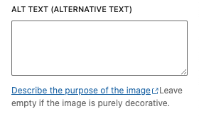
Describe the purpose of the image. Leave empty if the image is purely decorative.
Image size
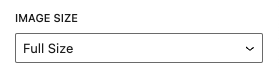
Set the size of the image (full image or cropped).
Options
- Thumbnail
- Full size
Image dimensions
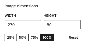
Set the size of the image.
Type panel
Type of image
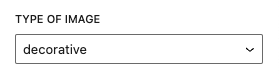
Set the type of the image. This is necessary for WCAG alt check. Describe the purpose of the image. This isn’t needed when the image is decoractive.
Options
- Decorative
- Informative
- Functional
- Complex
Styling panel
Elevation
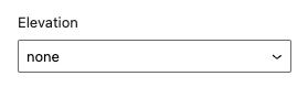
Add an elevation to the component (shadow).
Options
- none (default)
- low
- normal
- high
Elevation angle
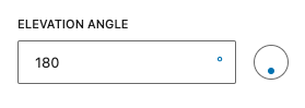
When an elevation is set. The elevation angle input is available. Set the direct of the shadow via the input.
Read the elevation documentation for more information and examples.
Advanced panel
Title attribute
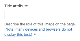
Describe the role of this image on the page.
Note: many devices and browsers do not display this text
HTML anchor
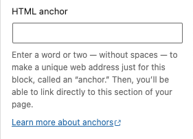
Add a custom id-attribute to the component.
Enter a word or two — without spaces — to make a unique web address just for this block, called an “anchor.” Then, you’ll be able to link directly to this section of your page.
An id-attribute must be unique on the entire page and can only contain one item (words can be separated with dashes or underscores).
Scroll to section link
panel-advanced-html-anchorLearn more about anchors: https://wordpress.org/support/article/page-jumps/
This can be used to create a scroll-to link. Create a link to “#[html-anchor]”.
Code example
Link example
Read the html anchor documentation for more information and examples.
Additional CSS class(es)
Add a custom class-attribute to the component.
Separate multiple classes with spaces.
Read the additional css class(es) documentation for more information and examples.
Toolbar
The following options are available in the Gutenberg toolbar.
Alignment
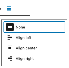
Change the alignment of the component.
options
- None (default)
- Align left
- Align center
- Align right
Link

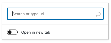
Use the chain link icon to insert a hyperlink to your highlighted text. Or use the CTRL + k (or Command+k) keyboard shortcut.
Example:
This a paragraph with a link.
Read the links documentation for more information and examples.
Crop

Edit the image. You can zoom in on the image, rotate it and change the aspect ratio.
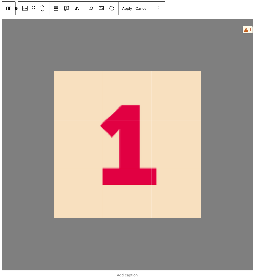
Add text over image
Don’t place text over images, this is in violation with the WCAG guidelines.

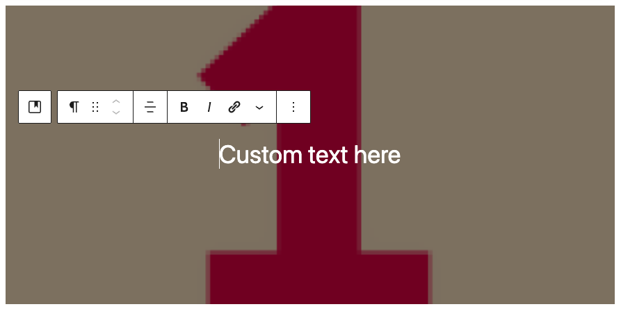
Add a text over the image.
Apply duotone filter

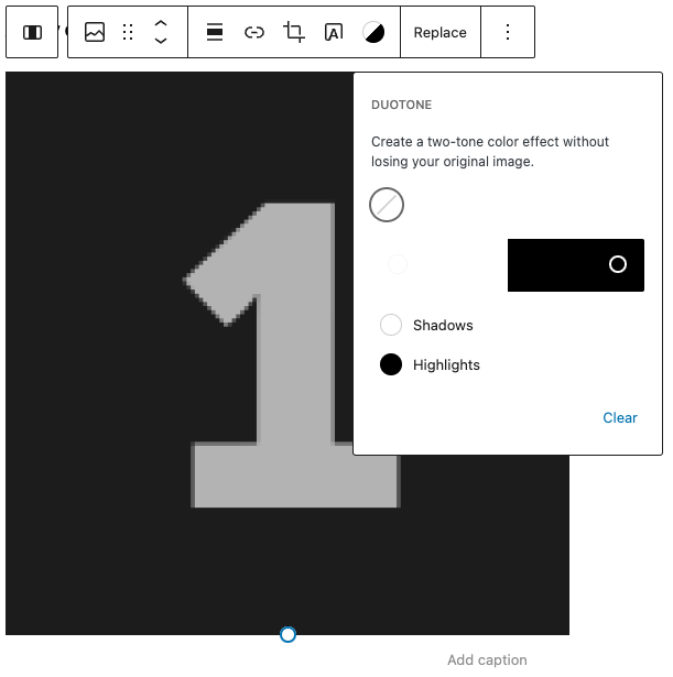
Change the color of the image by applying a duotone colorfilter.
Replace
Change the image for another image. You can choose to access the media library or upload a new image.