Component: Social link
The core/social-link component is the only direct child component of core/social-links. It’s not available elsewhere.
General
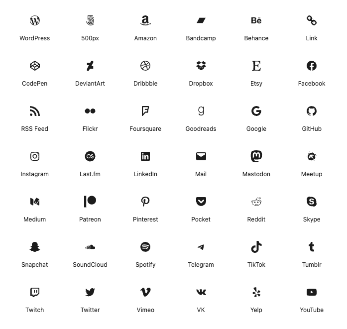
Display an icon linking to a social media profile or site.
Settings
[Platform] label panel
Link label
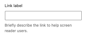
Briefly describe the link to help screen reader users.
Advanced panel
Additional CSS class(es)
Add a custom class-attribute to the component.
Separate multiple classes with spaces.
Read the additional css class(es) documentation for more information and examples.
Toolbar
Move left

Move the component within its parent. Place it before the component before the selected component. The button is disabled when the selected component is the first component in the parent.
Move right

Move the component within its parent. Place it after the component next to the selected component. The button is disabled when the selected component is the last component in the parent.
Justification
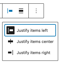
Change the justification of the nested components.
options
- Justify items left
- Justify items center
- Justify items right
Alignment
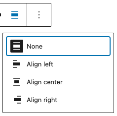
Change the alignment of the component.
options
- None (default)
- Align left
- Align center
- Align right
Wireframes
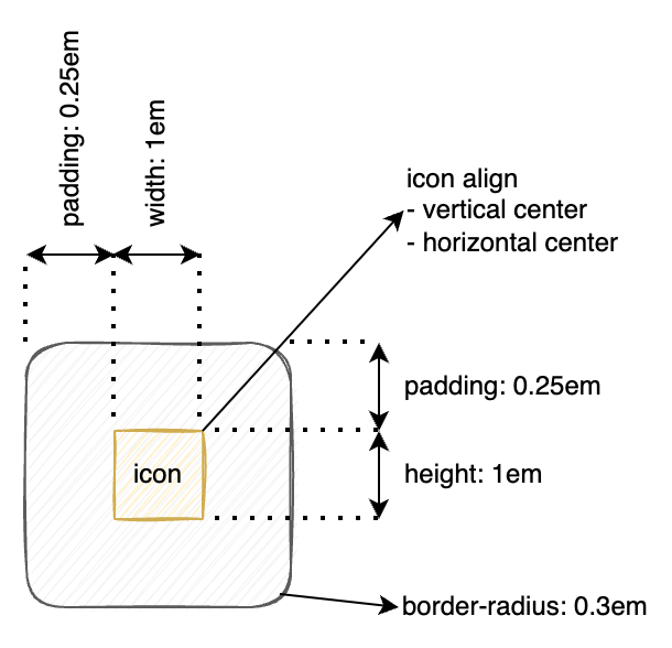
Icon
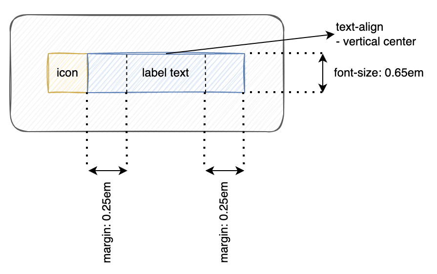
Icon with label
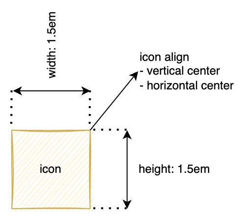
Logo only
logo only with label

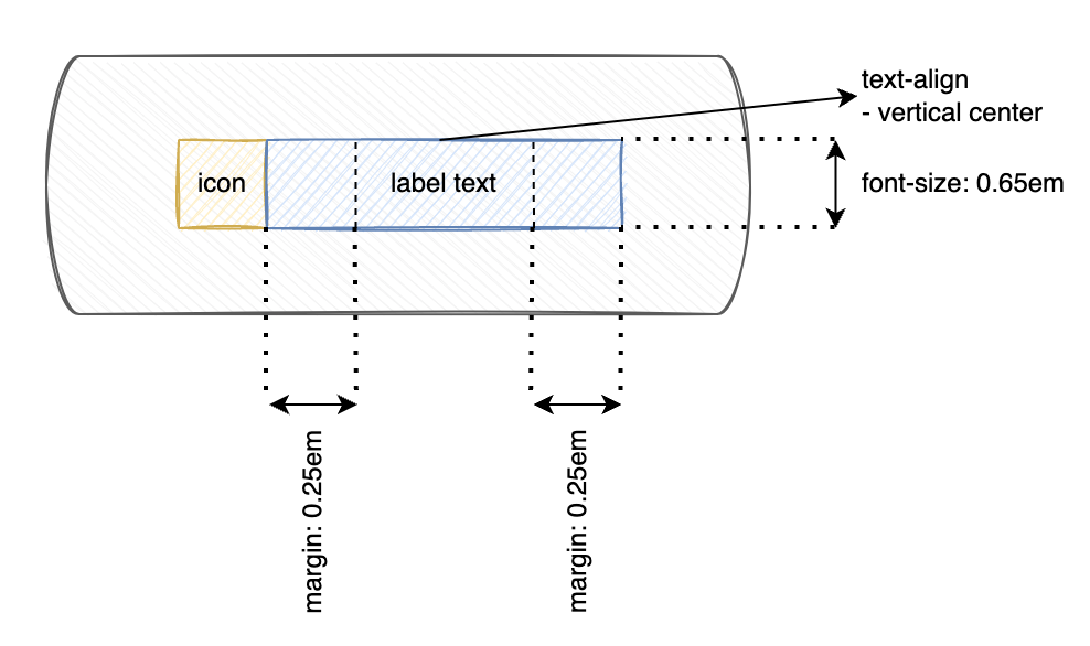
Pill shape
Pill shape with label