Plugin: Gravity Forms
We support Gravity Forms.
As of Gravity Forms v2.5 accessibility has greatly improved! Unfortunately not all Gravity Forms fields and Add-ons comply with WCAG 2.1 AA.
To create and implement an accessible form you can find the necessary information on this page. This is copied from https://docs.gravityforms.com/accessibility-checklist-for-gravity-forms/ and extended with our own modifications to make accessible forms. Not all settings and options of Gravity Forms are noted on this page, only those that impact accessibility and are modified by Fora11y.
Check the summary for a quick overview of accessibility settings.
General Settings
Go to the Gravity Forms settings page under Dashboard > Settings.
Output default CSS
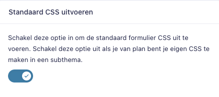
Enable this option to output the default form CSS. Disable it if you plan to create your own CSS in a child theme.
Choose setting: ON
This enables the Gravity Forms default CSS. Fora11y modifies a small part of the CSS which overwrites the color scheme as defined in the theme settings.
Output HTML5
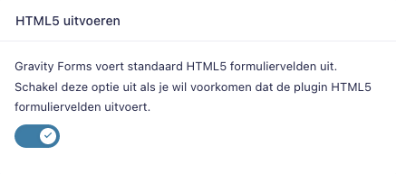
Gravity Forms outputs HTML5 form fields by default. Disable this option if you would like to prevent the plugin from outputting HTML5 form fields.
Choose setting: ON
Form Settings
Go to the Form Settings tab for the form you’re editing.
Label placement

Select the default label placement. Labels can be top aligned above a field, left aligned to the left of a field, or right aligned to the right of a field. This is a global label placement setting.
Choose setting: “Top aligned”
This places the labels above the field input. Screen readers will first find the label which describes the input.
Sub-Label Placement

Select the default sub-label placement. Sub-labels can be placed above the field inputs or below the field inputs. This setting can be overridden in the appearance settings for each field.
Choose setting: “Above Inputs”
This places the sub-labels above the field inputs. Screen readers will first find the label which describes the input. This is used for combined fields like the name input and address input.
Validation Summary

Enable to show a summary that lists validation errors on top of the form.
Choose setting: “On”
Required Field Indicator

Select how you would like to indicate required fields. You can choose either the default text or asterisk, or enter your own custom text. If legacy markup is not enabled and you choose an asterisk, a legend will appear at the top of the form to explain the asterisk to users.
Choose setting: Ensure the option to show a required field indicator is selected.
Enable legacy markup

Check this option to enable Gravity Forms’ legacy markup. This will hinder the accessibility of your form.
Choose setting: “Off”
Field settings
Autocomplete
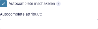
Common attributes used for autocomplete
| Autocomplete attribute | Input value |
|---|---|
| name | Full name |
| given-name | First name |
| family-name | Last name |
| username | A username |
| new-password | A new password (e.g., when creating an account or changing a password) |
| current-password | The current password for the account identified by the username field (e.g., when logging in) |
| organization | Company name corresponding to the person, address, or contact information in the other fields associated with this field |
| street-address or address-line1 | Street address (multiple lines, newlines preserved) |
| postal-code | Postal code, post code, ZIP code, CEDEX code (if CEDEX, append “CEDEX”, and the dissement, if relevant, to the address-level2 field) |
| bday | Birthday |
| sex | Gender identity (e.g., Male, Female) |
| url | Home page or other Web page corresponding to the company, person, address, or contact information in the other fields associated with this field |
| tel | Full telephone number, including country code |
| E-mail address |
More information on available autocomplete attributes: https://www.w3.org/TR/WCAG21/#input-purposes
Form Fields
The following field types can create accessibility issues, and are not recommended for use in an accessible form.
Standard Fields
Single line text
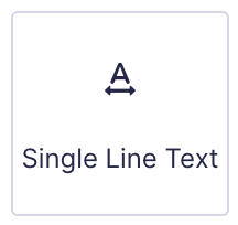
Depending on the information requested in this field an autocomplete attribute might be required.
More information: https://docs.gravityforms.com/single-line-text/
Paragraph text

Don’t use the Rich Text Editor in advanced settings
More information: https://docs.gravityforms.com/paragraph-text/
Drop down

More information: https://docs.gravityforms.com/drop-down/
Number
More information: https://docs.gravityforms.com/number/
Checkboxes
More information: https://docs.gravityforms.com/checkboxes/
Radio buttons

More information: https://docs.gravityforms.com/radio-buttons/
Hidden

More information: https://docs.gravityforms.com/hidden/
HTML
When using custom HTML you need to check if this is valid HTML for WCAG 2.1 AA
More Information: https://docs.gravityforms.com/html/
Section break
When using sections you need to check if the label and/ or description don’t contain texts that refer to fields. This isn’t accessible for screen readers.
More information: https://docs.gravityforms.com/section-break/
Page break
The Page field allows the creation of multi-page forms.
Settings:
- Progress Indicator
- Bar
- Steps
- None
- Style
- Select which progress bar style you would like to use. Select custom to choose your own text and background color.
- Page Names
- Name each of the pages on your form. Page names are displayed with the selected progress indicator.
- Display completed progress bar on confirmation
- Check this box if you would like the progress bar to display with the confirmation text.
Don’t disable the progress indicator with value ‘none’. This hides the page progress which is needed to visualize the progress to the visitor.
More information: https://docs.gravityforms.com/page-break/
Advanced Fields
Name
More information: https://docs.gravityforms.com/name/
Date
More information: https://docs.gravityforms.com/date/
Time
More information: https://docs.gravityforms.com/time/
Phone
More information: https://docs.gravityforms.com/phone/
Address
More information: https://docs.gravityforms.com/address-field/
Website
More information: https://docs.gravityforms.com/website/
More information: https://docs.gravityforms.com/email/
Password
More information: https://docs.gravityforms.com/password/
File upload
More information: https://docs.gravityforms.com/file-upload/
CAPTCHA

reCaptcha V2 isn’t accessible. An accessible alternative is the honeypot option, as can be found in the form settings.
More information: https://docs.gravityforms.com/captcha/
List
More information: https://docs.gravityforms.com/list/
Multiselect
Don’t use this field, this is not accessible
More information: https://docs.gravityforms.com/multi-select/
Consent
More information: https://docs.gravityforms.com/consent-field/
Post Fields
Title
Body
Excerpt
Tags
Category
Post image
Custom field
Pricing Fields
Product
Quantity
Option
Shipping
Total
Form submit


Summary for accessible forms
General settings
- Output default CSS: ON
- Output HTML5: ON
Form settings
- Label Placement: “Top aligned”
- Sub-Label Placement: “Above Inputs”
- Validation Summary: “On”
- Required Field Indicator: Ensure the option to show a required field indicator is selected.
- Form button: Choose “Text”. Use descriptive text
- Form button Conditional Logic: Do not enable conditional logic
- Enable legacy markup: “Off”
Form fields to avoid
- Multiselect
- HTML blocks with text that contains essential information
- Section breaks with text that contains essential information
- reCAPTCHA V2 (an accessible alternative is the honeypot option, as can be found in the form settings)
Field Settings
The form fields settings can be found in the right hand sidebar when you create or edit a form. If a setting is not mentioned here, it has no known accessibility issues.
- Field Label: always fill out the Field label, explain clearly to the user what needs to be filled out.
- Input mask: do not use an input mask. Leave that box unchecked.
- Field Label Visibility: always use a visible label, never hide it.
- Sub-Label Placement: above input.
- Custom Validation message: if possible, write meaningful to-the-point custom error messages.
- Enhanced User Interface: do not enable the enhanced User Interface for dropdowns.
- Multi-File Upload: do not enable Multi-File Upload with the File Upload field. Using single file upload is ok.
- Rich text Editor: Do not enable the Rich text editor.
- Autocomplete: Enable autocomplete for name, address and email fields. The default fields for these fields have the autocomplete values already filled out.
Adding a form to a page
Add the block for a form to the page and select the block settings:
- Form settings: enable the Form Title.
- Advanced settings: do not set a positive tabindex. Keep the tabindex value -1. This means that no tabindex will be set.
- Do not add more than one of the same form to a web page. Each form on the page must be unique.