Contrast toggle
A contrast toggle on a website is a functionality that allows users to adjust the appearance of the website to achieve better contrast between text and background. This is especially useful for users with visual impairments from eye conditions who have difficulty reading content with standard contrast.
By offering a contrast toggle, websites can improve their accessibility by enabling users with visual impairments or eye problems to read the content inclusively. It allows users to adjust the contrast level according to their needs, making it more comfortable and educational to navigate and consume the content.
The contrast button is located in the top menu (at the top of the page). Indicated by the text “increase contrast” and the contrast icon. If high contrast is active, the text “normal contrast” is displayed here with the contrast icon. The standard elements in Fora11y have been developed “contrast-first”. This means that we first work out the high contrast mode and then look at color settings in the color palette.
Examples:
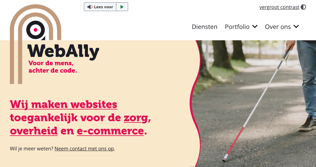
A website shown in normal contrast
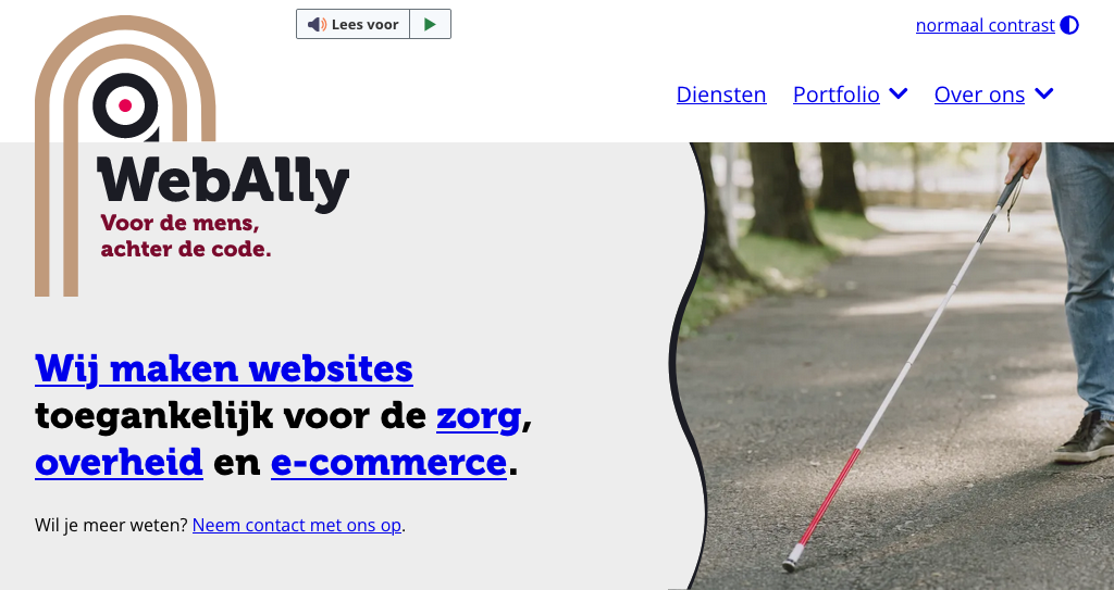
A website shown in high contrast
Local storage
When the vistor enables high contrast mode, a variable is stored in the local storage.
By default high contrast is disabled and no data is stored in the local storage. When enabled the variable contrastMode with the value true is set. When disabled (after it’s been enabled) the variable contrastMode with the value null is set.
Code adjustment
To define if contrast should be shown in normal of high contrast mode a body class is implemented. By default the body class is set with <body class="normal-contrast">. When high contrast is enabled this class is removed from the body.
This is what we define as ‘contrast-first’ development.