Component: Column
General
A single column within a columns block.
The core/column component is the only direct child component of core/columns. It’s not available elsewhere.
Settings
Styling panel
Background image
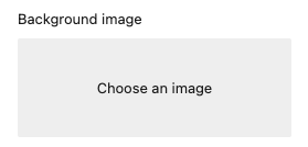
Add a background image to the component
The image is selected via the WordPress media library.
When an image is selected the following options are available:
Display image as
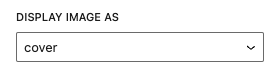
Set the behaviour of the background
options
- cover
- contain
- automatic
Position of the image
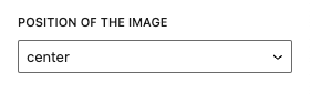
options
- center
- top
- bottom
- left
- right
Read the background image documentation for more information and examples.
Elevation
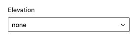
Add an elevation to the component (shadow).
Options
- none (default)
- low
- normal
- high
Elevation angle
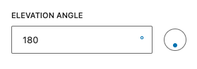
When an elevation is set. The elevation angle input is available. Set the direct of the shadow via the input.
Read the elevation documentation for more information and examples.
Positioning panel
Space content

Apply extra spacing to the content within the column. This creates more whitespace around alle elements.
Read the space content documentation for more information and examples.
Padding
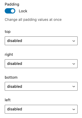
Add custom padding to the component.
Lock
When “lock” is enabled all values are linked to each other. When changing one value all other values are synced to this value. Disable the “lock” to change each value separatly.
Top / Right / Bottom / Left
Set the padding at the selected side of the component.
Options
- disabled (default)
- 0
- 2
- 4
- 8
- 12
- 16
- 24
- 32
- 48
- 64
- 96
- 128
- 192
- 256
- 384
- 512
- 640
- 768
Read the padding documentation for more information and examples.
Coloring panel
The Fora11y coloring panel is still in beta. We advice not to use the ‘main color’, this will be deprecated in a future version. Use the default WordPress ‘color’ panel. Or use the coloring panel in ‘custom colors’ mode.
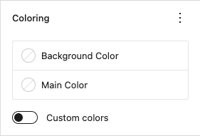
Set custom colors for the component.
Background color
Set the background color.
Main color
Deprecated!
Set the main color. This setting applies ligt or dark colors based on parent elements
Custom colors
When activated a custom text color can be set and more colors are available to choose from.
Color panel
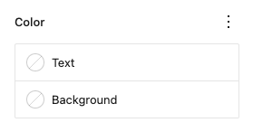
Text
Set a custom text color.
Background
Set a custom background color.
Advanced panel
HTML anchor
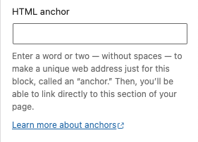
Add a custom id-attribute to the component.
Enter a word or two — without spaces — to make a unique web address just for this block, called an “anchor.” Then, you’ll be able to link directly to this section of your page.
An id-attribute must be unique on the entire page and can only contain one item (words can be separated with dashes or underscores).
Scroll to section link
panel-advanced-html-anchorLearn more about anchors: https://wordpress.org/support/article/page-jumps/
This can be used to create a scroll-to link. Create a link to “#[html-anchor]”.
Code example
Link example
Read the html anchor documentation for more information and examples.
Additional CSS class(es)
Add a custom class-attribute to the component.
Separate multiple classes with spaces.
Read the additional css class(es) documentation for more information and examples.
Toolbar
Move column

Move the column within the parent columns. This changes the order of the column.
When there is only one column within the parent columns the order can’t be changed. The “move left” and “move right” icons are disabled.
When the column is the first column within the parent columns you can’t move it to the left. The “move left” icon is disabled.
When the column is the last column within the parent columns you can’t move it to the right. The “move right” icon is disabled.
Vertical alignment
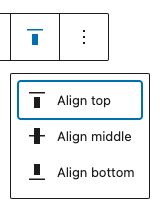
Vertically align the column based on the content.
Options
- Align top
- Align middle
- Align bottom