Component: Columns
General
Display content in multiple columns, with blocks added to each column.
Settings
Columns panel
Columns
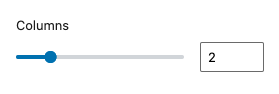
Within the columns component you can set one to six columns.
You can edit the number of columns by clicking on the up and down arrows, dragging the slider to the right or left or by typing the number directly in the field.
Read the columns documentation for more information and examples.
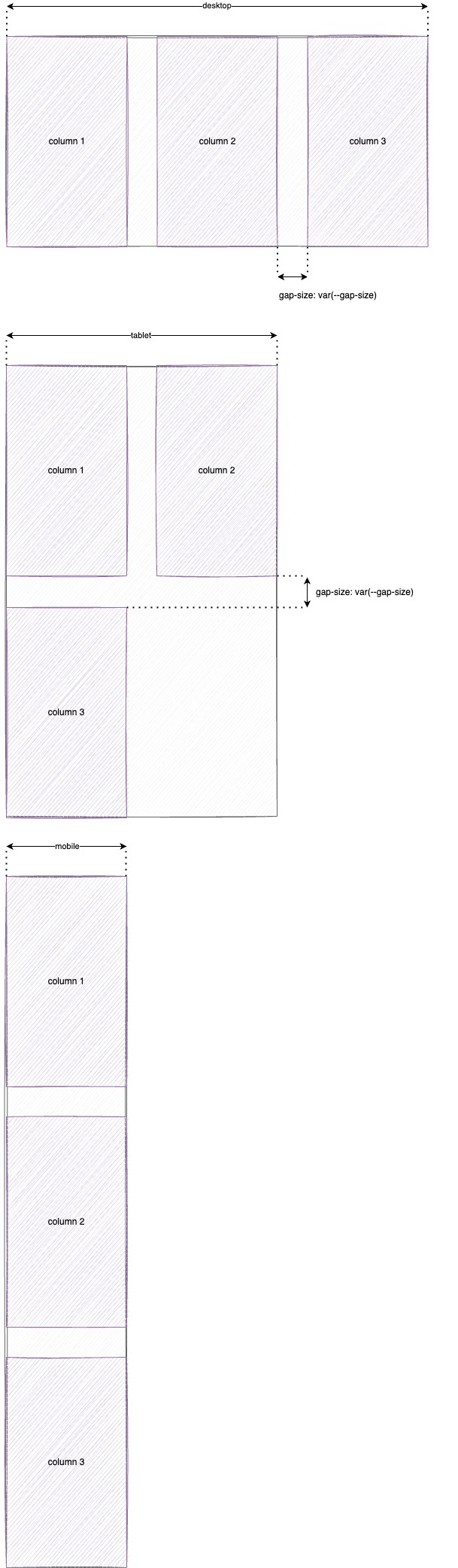
Stack on mobile
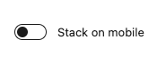
By default WordPress has three viewports. Desktop, tablet and mobile. On the desktop viewport fractions can be used to create custom column widths. For the tablet and mobile viewports a default settings is applied.
- Desktop: customisable column widths
- Tablet: all columns are forced to a 1fr + 1fr grid (50% width)
- Mobile: all columns are forced to a 1fr grid (100% width)
Read the stack on mobile documentation for more information and examples.
Grid layout panel
This panel is hidden when the column count is one (single column)
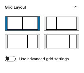
Grid layout
Based on the amount of columns set via the columns panel a variety of common layouts is shown which can be selected to set the grid layout for the columns.
If the basic layouts don’t show the layout you need you can create your own layout via the “Use advanced grid settings
Advanced grid settings
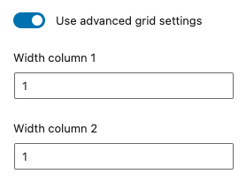
When enabled for each column available in the columns component a number input is shown. The width is based on CSS fractions1. Each number (fraction) is the size of the column divided by the total amount of fractions.
1More information about fractions (fr): go to css-tricks.com.
Fraction examples
- 1 + 1 = one half column + one half column
- 1 + 2 = one third column + two third column
- 40 + 60 = 40% column + 60% column (this is the same as “4 + 6” or “2 + 3”)
- 1 + 2 + 3 = one sixth column + one third column + one half column
Read the grid layouts documentation for more information and examples.
Styling panel
Background image
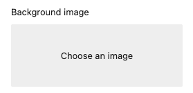
Add a background image to the component
The image is selected via the WordPress media library.
When an image is selected the following options are available:
Display image as
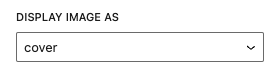
Set the behaviour of the background
options
- cover
- contain
- automatic
Position of the image
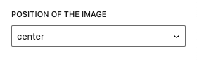
options
- center
- top
- bottom
- left
- right
Read the background image documentation for more information and examples.
Elevation
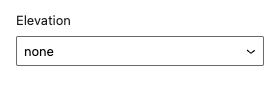
Add an elevation to the component (shadow).
Options
- none (default)
- low
- normal
- high
Elevation angle
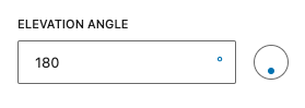
When an elevation is set. The elevation angle input is available. Set the direct of the shadow via the input.
Read the elevation documentation for more information and examples.
Fora11y positioning panel
Full-width (background and content)
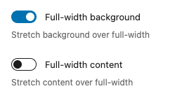
The content inside the columns is boxed within the default width (1168px). It’s possible to stretch the background to full-width and it’s possible to stretch the content to full-width. These two settings are linked to each other. When the content is set to full-width the background must also be set to full-width (this is forced). When te background stretch is disabled, the content stretch must also be disabled (this is also forced).
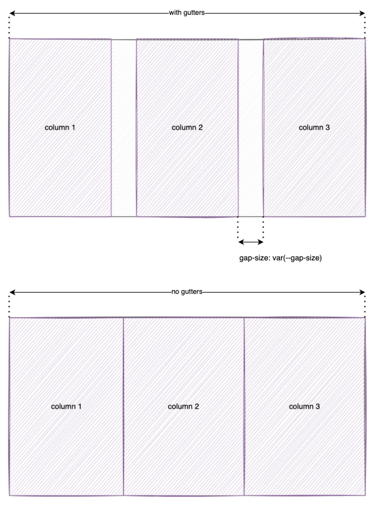
Gutters
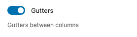
Add space (gap / gutters) between the columns.
The default gap size is set in customize settings (todo: link to customize settings)
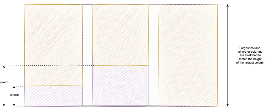
Equal-height
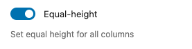
Forces all columns to the same height (the longest column defines the height, all other columns get this height). This is mostly used for columns with a background color.
Margin
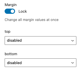
Add custom margin to the component.
Lock
When “lock” is enabled all values are linked to each other. When changing one value all other values are synced to this value. Disable the “lock” to change each value separatly.
Top / Bottom
Set the margin at the selected side of the component.
Options
- disabled (default)
- 0
- 2
- 4
- 8
- 12
- 16
- 24
- 32
- 48
- 64
- 96
- 128
- 192
- 256
- 384
- 512
- 640
- 768
Read the margin documentation for more information and examples.
Padding
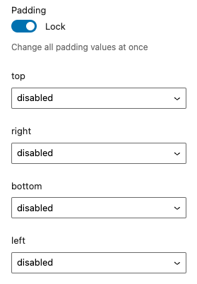
Add custom padding to the component.
Lock
When “lock” is enabled all values are linked to each other. When changing one value all other values are synced to this value. Disable the “lock” to change each value separatly.
Top / Right / Bottom / Left
Set the padding at the selected side of the component.
Options
- disabled (default)
- 0
- 2
- 4
- 8
- 12
- 16
- 24
- 32
- 48
- 64
- 96
- 128
- 192
- 256
- 384
- 512
- 640
- 768
Read the padding documentation for more information and examples.
Coloring panel
The Fora11y coloring panel is still in beta. We advice not to use the ‘main color’, this will be deprecated in a future version. Use the default WordPress ‘color’ panel. Or use the coloring panel in ‘custom colors’ mode.
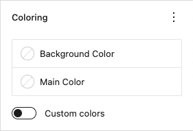
Set custom colors for the component.
Background color
Set the background color.
Main color
Deprecated!
Set the main color. This setting applies ligt or dark colors based on parent elements
Custom colors
When activated a custom text color can be set and more colors are available to choose from.
Color panel
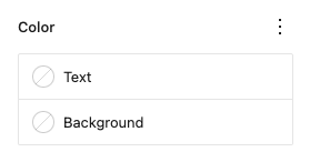
Text
Set a custom text color.
Background
Set a custom background color.
Advanced panel
HTML anchor
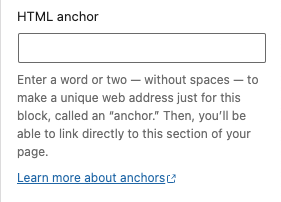
Add a custom id-attribute to the component.
Enter a word or two — without spaces — to make a unique web address just for this block, called an “anchor.” Then, you’ll be able to link directly to this section of your page.
An id-attribute must be unique on the entire page and can only contain one item (words can be separated with dashes or underscores).
Scroll to section link
panel-advanced-html-anchorLearn more about anchors: https://wordpress.org/support/article/page-jumps/
This can be used to create a scroll-to link. Create a link to “#[html-anchor]”.
Code example
Link example
Read the html anchor documentation for more information and examples.
Additional CSS class(es)
Add a custom class-attribute to the component.
Separate multiple classes with spaces.
Read the additional css class(es) documentation for more information and examples.
Wireframes
Default
The default columns are ‘boxed’ at 1168px. The width of the box can be changed in the customize settings.
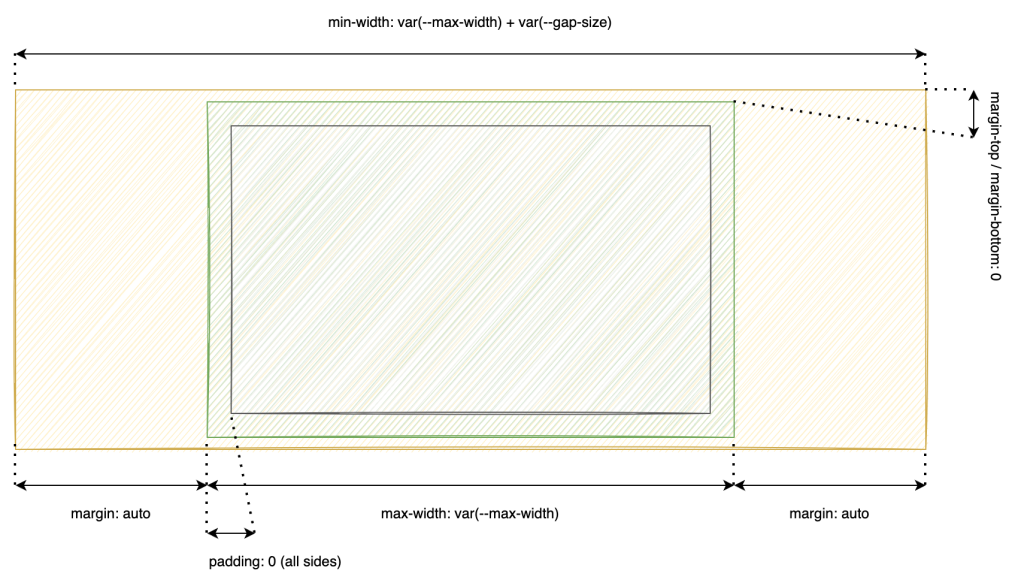
| Property | Value | Setting |
|---|---|---|
| max-width | 1168px | Customizer |
| margin-top / margin-bottom | 0 | Panel margin |
| margin-left / margin-right | auto | |
| padding | 0 | Panel padding |
Responsive
When the screen is smaller than the sum of the box size + the gap size the responsive design is used.
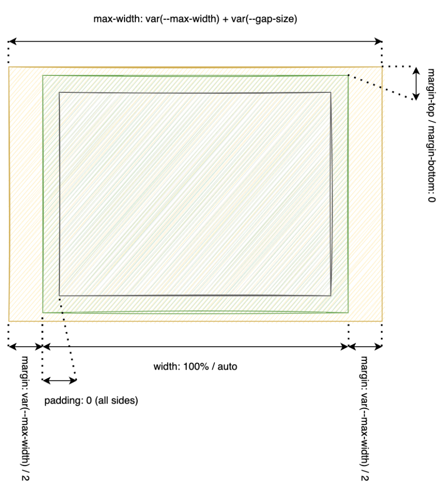
| Property | Value | Setting |
|---|---|---|
| margin-top / margin-bottom | 0 | Panel margin |
| margin-left / margin-right | calc(–gap-size/2) | Customizer |
| padding | 0 | Panel padding |
Full-width
Via the positioning panel the full-width layout can be enabled. When enabled the boxed design is discarded and the columns container is stretched over the full width of its parent container.
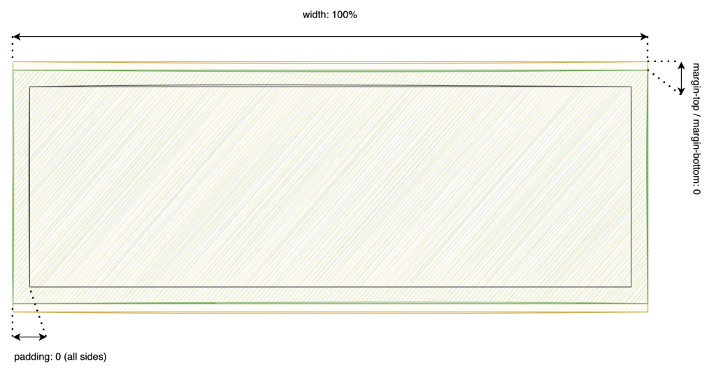
| Property | Value | Setting |
|---|---|---|
| margin-top / margin-bottom | 0 | Panel margin |
| padding | 0 | Panel padding |
Stack on mobile
By default WordPress has three viewports. Desktop, tablet and mobile. On the desktop viewport fractions can be used to create custom column widths. For the tablet and mobile viewports a default settings is applied.
- Desktop: customisable column widths
- Tablet: all columns are forced to a 1fr + 1fr grid (50% width)
- Mobile: all columns are forced to a 1fr grid (100% width)
Gutters
Equal height