Component: Group
General
The Group component exists of three variants: Group, Row and Stack. All variants contain components and group them together with specific behaviour. Via the advanced panel settings the component wrapper can be defined (e.g. a <div> or an <aside>). See the advanced HTML element settings for all options.
Group
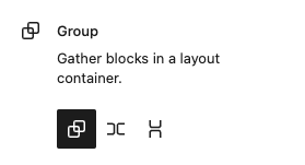
Gather blocks in a layout container.
Row
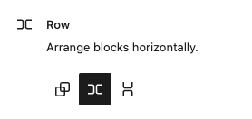
Arrange blocks horizontally.
All child components are arranged next to each other. There are settings to adjust alignment.
Stack
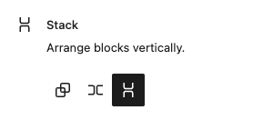
Arrange blocks vertically.
All child components are arranged below each other. There are settings to adjust alignment.
Settings
Layout
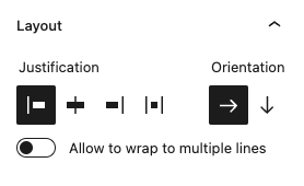
This panel is only available for the “Row” and “Stack” variant.
Define the behaviour for the nestend components.
Justification
Alignment of the nestend components
options
- Left aligned
- Center aligned
- Right aligned
- Justified
Orientation
Define the orientation to “horizontal” or “vertical”. This is synced with the variant type. The type “row” is always horizontally oriented and the type “stack” is always vertically oriented. When changing the type the orientation changes in sync and the same behaviour occurs when changing the orientation.
Allow to wrap to multiple lines
When horizontally aligned all nested components are forced on one line. When “allow to wrap” is enabled the nested components are distributed over multiple lines when there isn’t enough space on the line.
Styling panel
Background image
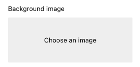
Add a background image to the component
The image is selected via the WordPress media library.
When an image is selected the following options are available:
Display image as
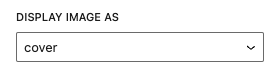
Set the behaviour of the background
options
- cover
- contain
- automatic
Position of the image
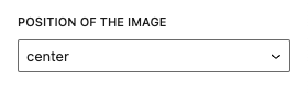
options
- center
- top
- bottom
- left
- right
Read the background image documentation for more information and examples.
Fora11y positioning panel
Margin
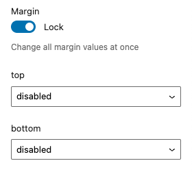
Add custom margin to the component.
Lock
When “lock” is enabled all values are linked to each other. When changing one value all other values are synced to this value. Disable the “lock” to change each value separatly.
Top / Bottom
Set the margin at the selected side of the component.
Options
- disabled (default)
- 0
- 2
- 4
- 8
- 12
- 16
- 24
- 32
- 48
- 64
- 96
- 128
- 192
- 256
- 384
- 512
- 640
- 768
Read the margin documentation for more information and examples.
Padding
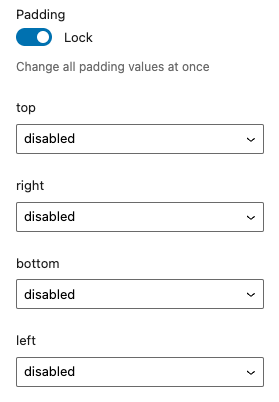
Add custom padding to the component.
Lock
When “lock” is enabled all values are linked to each other. When changing one value all other values are synced to this value. Disable the “lock” to change each value separatly.
Top / Right / Bottom / Left
Set the padding at the selected side of the component.
Options
- disabled (default)
- 0
- 2
- 4
- 8
- 12
- 16
- 24
- 32
- 48
- 64
- 96
- 128
- 192
- 256
- 384
- 512
- 640
- 768
Read the padding documentation for more information and examples.
Coloring panel
The Fora11y coloring panel is still in beta. We advice not to use the ‘main color’, this will be deprecated in a future version. Use the default WordPress ‘color’ panel. Or use the coloring panel in ‘custom colors’ mode.
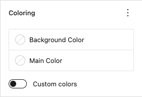
Set custom colors for the component.
Background color
Set the background color.
Main color
Deprecated!
Set the main color. This setting applies ligt or dark colors based on parent elements
Custom colors
When activated a custom text color can be set and more colors are available to choose from.
Color panel
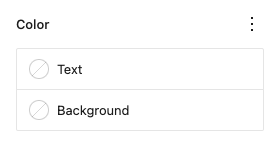
Text
Set a custom text color.
Background
Set a custom background color.
Typography panel
Size
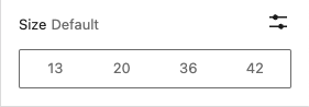
Change the font-size for the component.
Options:
- Small (13px)
- Medium (20px)
- Large (36px)
- Extra large(42px)
- Custom size (font-size in “px”, “em” or “rem”)
Examples:
Small font-size (13px)
normal font-size
Medium font-size (20px)
Large font-size (36px)
Extra large font-size (42px)
Custom font-size (3em)
Read the text size documentation for more information and examples.
Appearance
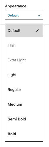
Change the text font-weight and font-style.
Options:
| option | CSS |
|---|---|
| default | |
| thin | font-style:normal font-weight:100 |
| extra-light | font-style:normal font-weight:200 |
| light | font-style:normal font-weight:300 |
| regular | font-style:normal font-weight:400 |
| medium | font-style:normal font-weight:500 |
| semi-bold | font-style:normal font-weight:600 |
| bold | font-style:normal font-weight:700 |
| extra-bold | font-style:normal font-weight:800 |
| black | font-style:normal font-weight:900 |
| thin-italic | font-style:italic font-weight:100 |
| extra-light-italic | font-style:italic font-weight:200 |
| light-italic | font-style:italic font-weight:300 |
| regular-italic | font-style:italic font-weight:400 |
| medium-italic | font-style:italic font-weight:500 |
| semi-bold-italic | font-style:italic font-weight:600 |
| bold-italic | font-style:italic font-weight:700 |
| extra-bold-italic | font-style:italic font-weight:800 |
| black-italic | font-style:italic font-weight:900 |
Examples:
Appearance “Extra Light”
Appearance “Semi Bold”
Appearance “Black”
Appearance “Medium Italic”
Appearance “Extra Bold Italic”
Read the text appearance documentation for more information and examples.
Letter case
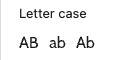
Change text letter case.
Options:
- All letters in caps
- All letters in lower case
- All letters in lower case with the first letter in caps
Examples:
All letters in caps
All letters in lower case
All letters in lower case with the first letter in caps
Read the letter case documentation for more information and examples.
Letter spacing
Change text letter case.
Options:
- All letters in caps
- All letters in lower case
- All letters in lower case with the first letter in caps
Examples:
All letters in caps
All letters in lower case
All letters in lower case with the first letter in caps
Read the letter spacing documentation for more information and examples.
Advanced panel
HTML element
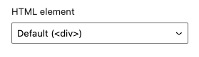
Define the wrapper element.
options
<div>(default)<header><main><section><article><aside><footer>
HTML anchor
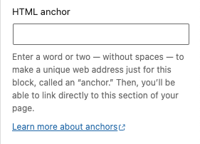
Add a custom id-attribute to the component.
Enter a word or two — without spaces — to make a unique web address just for this block, called an “anchor.” Then, you’ll be able to link directly to this section of your page.
An id-attribute must be unique on the entire page and can only contain one item (words can be separated with dashes or underscores).
Scroll to section link
panel-advanced-html-anchorLearn more about anchors: https://wordpress.org/support/article/page-jumps/
This can be used to create a scroll-to link. Create a link to “#[html-anchor]”.
Code example
Link example
Read the html anchor documentation for more information and examples.
Additional CSS class(es)
Add a custom class-attribute to the component.
Separate multiple classes with spaces.
Read the additional css class(es) documentation for more information and examples.