Panel: Typography
The typography panel is used to adjust texts in components
Appearance
core/button core/group core/heading core/list core/paragraph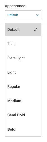
Change the text font-weight and font-style.
Options:
| option | CSS |
|---|---|
| default | |
| thin | font-style:normal font-weight:100 |
| extra-light | font-style:normal font-weight:200 |
| light | font-style:normal font-weight:300 |
| regular | font-style:normal font-weight:400 |
| medium | font-style:normal font-weight:500 |
| semi-bold | font-style:normal font-weight:600 |
| bold | font-style:normal font-weight:700 |
| extra-bold | font-style:normal font-weight:800 |
| black | font-style:normal font-weight:900 |
| thin-italic | font-style:italic font-weight:100 |
| extra-light-italic | font-style:italic font-weight:200 |
| light-italic | font-style:italic font-weight:300 |
| regular-italic | font-style:italic font-weight:400 |
| medium-italic | font-style:italic font-weight:500 |
| semi-bold-italic | font-style:italic font-weight:600 |
| bold-italic | font-style:italic font-weight:700 |
| extra-bold-italic | font-style:italic font-weight:800 |
| black-italic | font-style:italic font-weight:900 |
Examples:
Appearance “Extra Light”
Appearance “Semi Bold”
Appearance “Black”
Appearance “Medium Italic”
Appearance “Extra Bold Italic”
Decoration
core/button core/group core/heading core/list core/paragraph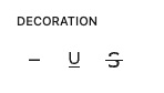
Change text decoration.
Options
- None
- Underline
- Strikethrough
Drop cap
core/paragraph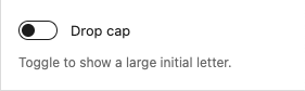
Show an enlarged first letter in the text.
Example:
Lorem ipsum dolor sit amet, consectetur adipiscing elit. Duis quis molestie velit, vel molestie purus. Quisque imperdiet turpis orci, a rhoncus nibh feugiat id. Nulla sapien mauris, gravida vitae faucibus et, luctus quis enim. Mauris ac nisl id ex finibus faucibus vel sit amet lacus. Suspendisse laoreet efficitur egestas. Proin viverra et arcu eget efficitur. Ut maximus consectetur accumsan. Donec sit amet laoreet dolor, nec placerat elit. Mauris vitae euismod justo. Morbi ut orci sit amet velit lacinia bibendum non et dolor. Vestibulum dapibus varius venenatis.
Size
core/button core/group core/heading core/list core/paragraph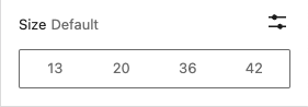
Change the font-size for the component.
Options:
- Small (13px)
- Medium (20px)
- Large (36px)
- Extra large(42px)
- Custom size (font-size in “px”, “em” or “rem”)
Examples:
Small font-size (13px)
normal font-size
Medium font-size (20px)
Large font-size (36px)
Extra large font-size (42px)
Custom font-size (3em)
Letter case
core/button core/group core/heading core/list core/paragraph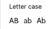
Change text letter case.
Options:
- All letters in caps
- All letters in lower case
- All letters in lower case with the first letter in caps
Examples:
All letters in caps
All letters in lower case
All letters in lower case with the first letter in caps
Letter spacing
core/button core/group core/heading core/list core/paragraph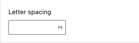
Change text letter spacing.
Options:
- Custom size (font-size in “px”, “em” or “rem”)
Examples:
Text with 5px letter spacing.
Text with 0.25em letter spacing.