Component: Paragraph
General

The paragraph component is used to write plain texts. It can be styled via Gutenberg options.
WCAG summary
Links
Behaviour and color
When adding a link to the component, it distinguishes itself from surrounding text with an underline. When hovering over the link the underline is hidden.
The color of the link is based on the coloring of the panel (see the coloring panel settings)
Link to an external website
Fora11y checks all links with the main site url. When the url set in a link doesn’t match the site url an ‘outlink icon’ is added. This doesn’t indicate that the link opens in a new tab or window. It only indicates that the link leads to a webpage outside of the current website.
Inline image
When working with inline images the alt tag needs to be set correctly. [todo: link to alt tag info]
Highlight
When applying a highlight on text, the contrast check isn’t implemented yet. Therefore you have to manually check if the fore- and background-color are of sufficient contrast.
Settings
Coloring panel
The Fora11y coloring panel is still in beta. We advice not to use the ‘main color’, this will be deprecated in a future version. Use the default WordPress ‘color’ panel. Or use the coloring panel in ‘custom colors’ mode.
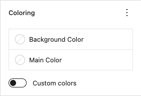
Set custom colors for the component.
Background color
Set the background color.
Main color
Deprecated!
Set the main color. This setting applies ligt or dark colors based on parent elements
Custom colors
When activated a custom text color can be set and more colors are available to choose from.
Color panel
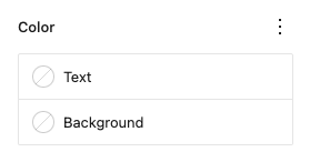
Text
Set a custom text color.
Background
Set a custom background color.
Typography panel
Size

Change the font-size for the component.
Options:
- Small (13px)
- Medium (20px)
- Large (36px)
- Extra large(42px)
- Custom size (font-size in “px”, “em” or “rem”)
Examples:
Small font-size (13px)
normal font-size
Medium font-size (20px)
Large font-size (36px)
Extra large font-size (42px)
Custom font-size (3em)
Read the text size documentation for more information and examples.
Appearance
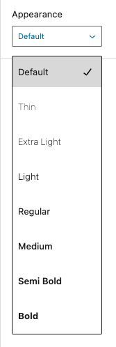
Change the text font-weight and font-style.
Options:
| option | CSS |
|---|---|
| default | |
| thin | font-style:normal font-weight:100 |
| extra-light | font-style:normal font-weight:200 |
| light | font-style:normal font-weight:300 |
| regular | font-style:normal font-weight:400 |
| medium | font-style:normal font-weight:500 |
| semi-bold | font-style:normal font-weight:600 |
| bold | font-style:normal font-weight:700 |
| extra-bold | font-style:normal font-weight:800 |
| black | font-style:normal font-weight:900 |
| thin-italic | font-style:italic font-weight:100 |
| extra-light-italic | font-style:italic font-weight:200 |
| light-italic | font-style:italic font-weight:300 |
| regular-italic | font-style:italic font-weight:400 |
| medium-italic | font-style:italic font-weight:500 |
| semi-bold-italic | font-style:italic font-weight:600 |
| bold-italic | font-style:italic font-weight:700 |
| extra-bold-italic | font-style:italic font-weight:800 |
| black-italic | font-style:italic font-weight:900 |
Examples:
Appearance “Extra Light”
Appearance “Semi Bold”
Appearance “Black”
Appearance “Medium Italic”
Appearance “Extra Bold Italic”
Read the text appearance documentation for more information and examples.
Letter case

Change text letter case.
Options:
- All letters in caps
- All letters in lower case
- All letters in lower case with the first letter in caps
Examples:
All letters in caps
All letters in lower case
All letters in lower case with the first letter in caps
Read the letter case documentation for more information and examples.
Letter spacing

Change text letter case.
Options:
- All letters in caps
- All letters in lower case
- All letters in lower case with the first letter in caps
Examples:
All letters in caps
All letters in lower case
All letters in lower case with the first letter in caps
Read the letter spacing documentation for more information and examples.
Drop cap

Show an enlarged first letter in the text.
Example:
First letter in large font-size. Lorem ipsum dolor sit amet, consectetur adipiscing elit. Duis quis molestie velit, vel molestie purus. Quisque imperdiet turpis orci, a rhoncus nibh feugiat id. Nulla sapien mauris, gravida vitae faucibus et, luctus quis enim. Mauris ac nisl id ex finibus faucibus vel sit amet lacus. Suspendisse laoreet efficitur egestas. Proin viverra et arcu eget efficitur. Ut maximus consectetur accumsan. Donec sit amet laoreet dolor, nec placerat elit. Mauris vitae euismod justo. Morbi ut orci sit amet velit lacinia bibendum non et dolor. Vestibulum dapibus varius venenatis.
Read the drop cap documentation for more information and examples.
Advanced panel
HTML anchor
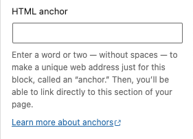
Add a custom id-attribute to the component.
Enter a word or two — without spaces — to make a unique web address just for this block, called an “anchor.” Then, you’ll be able to link directly to this section of your page.
An id-attribute must be unique on the entire page and can only contain one item (words can be separated with dashes or underscores).
Scroll to section link
panel-advanced-html-anchorLearn more about anchors: https://wordpress.org/support/article/page-jumps/
This can be used to create a scroll-to link. Create a link to “#[html-anchor]”.
Code example
Link example
Read the html anchor documentation for more information and examples.
Additional CSS class(es)
Add a custom class-attribute to the component.
Separate multiple classes with spaces.
Read the additional css class(es) documentation for more information and examples.
Toolbar
The following options are available in the Gutenberg toolbar.
Text alignment
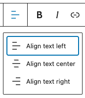
Using the alignment drop-down from the toolbar, you are able to align the whole paragraph text to the left, make it center-aligned or orient it to the right.
Options:
- Align text left
- Align text center
- Align text right
Examples:
Left aligned text (default).
Center aligned text.
Right aligned text.
Read the text-alignment documentation for more information and examples.
Bold

Used quite frequently, Bold formatting has their own buttons on the Toolbar. The shortcuts are CTRL + b (or CMD + b) for bold.
Example:
This a paragraph with bold text.
Read the bold text documentation for more information and examples.
Italic

Used quite frequently, Italics formatting has their own buttons on the Toolbar. The shortcuts are CTRL + i (or CMD + i) for italics.
Example:
This a paragraph with italic text.
Read the italic text documentation for more information and examples.
Link

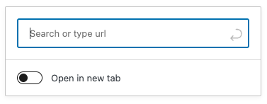
Use the chain link icon to insert a hyperlink to your highlighted text. Or use the CTRL + k (or Command+k) keyboard shortcut.
Example:
This a paragraph with a link.
Read the links documentation for more information and examples.
Highlight
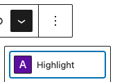
Using the “Highlight” option allows you to change the color for selected text and its background.
Check the color contrast when creating a highlight!
Example:
This a paragraph with highlighted text.
Read the highlight documentation for more information and examples.
Inline code
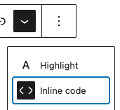
Use the inline code feature to format code snippets within your text differently. Not only that, but Inline code formatting also prevents the code to be executed instead of displayed.
Example:
This a paragraph with inline code.
Read the inline code documentation for more information and examples.
Inline image
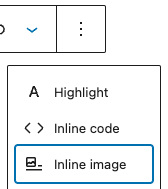
The inline image feature allows you to add an image to your paragraph. It has one option: enter the desired pixel width for your image.
Example:
This a paragraph with an inline ![]() image.
image.
Read the inline image documentation for more information and examples.
Keyboard input
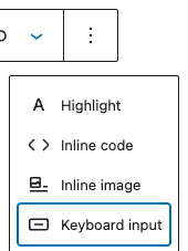
Using the “Keyboard Input” option allows you to add the <kbd> tag to selected text.
Example:
This is a paragraph with a keyboard tag.
Read the the keyboard input documentation for more information and examples.
Strikethrough
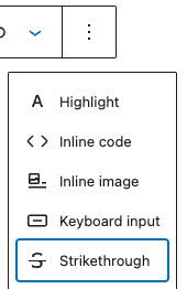
Using the “Strikethrough” option adds a line through your highlighted text.
Example:
This is a paragraph with strikethrough text.
Read the strikethrough documentation for more information and examples.
Subscript
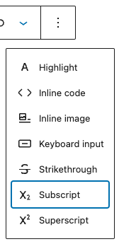
The “Subscript” option allows you to add subscript to your highlighted text.
Example:
This is a paragraph with subscript text.
Read the subscript documentation for more information and examples.
Superscript
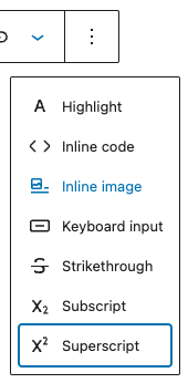
The “Superscript” option allows you to add superscript to your highlighted text.
Example:
This is a paragraph with superscript text.
Read the superscript documentation for more information and examples.
Wireframes
Paragraph

| Element | Attribute | Value | Setting |
|---|---|---|---|
| text | font-size | 1em (variable) | Typography – Size |
| text | line-height | 1.5em | |
| text | color | inherit (variable) | Coloring panel |
Paragraph with background
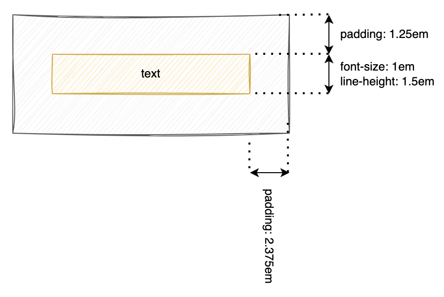
| Element | Attribute | Value | Setting |
|---|---|---|---|
| text | font-size | 1em (variable) | Typography – Size |
| text | line-height | 1.5em | |
| text | color | inherit (variable) | Coloring panel |
| text | background | (variable) | Coloring panel |
| text | padding-left/right | 2.375em | |
| text | padding-top/bottom | 1.25em |